Today we completed a new logo design for Elite Branding, a creative signage company based in Dublin. This blog post will highlight the steps that we took to develop their new brand identity and their Brand Pack.
Logo Design Elite Branding
A couple of weeks ago Ciaran from Elite Branding got in touch to see if we could help them with their new logo and website. Elite Branding are a long established signage company based in Rathcoole, Dublin with over 35 years history. Their previous logo was looking tired and did not fully reflect the quality of their work and their mission statement.
A brand to reflect their mission
Elite Branding have a powerful mission statement and we wanted to reflect this in their new brand identity.
We provide the complete Signage experience; project managed, designed, produced in-house, delivered and fitted by our own team of Master craftspeople. All of our signs are manufactured in-house giving the customer peace of mind and us total control of quality.
Elite Branding Mission Statement
There are 3 key elements that pop from their mission statement: Signage, Master Craftspeople and Quality. The first step was to explore the brand in a brainstorm to get the creative juices flowing.
Brainstorm of Elite Branding Business
On our whiteboard I started to explore Elite Branding to determine a direction that logos, icons and the brand itself could take. Many ideas started to spring in to my mind as I explored the business through words and it was time to start sketching.
Drawing out ideas – rapid, effective brainstorming
When I had finished exploring the brand on the whiteboard I moved to a blank sheet of paper to start the new logo design. I always draw in just black and white when starting logo designs. This process allows me to explore ideas rapidly and define which ideas are clear and legible.
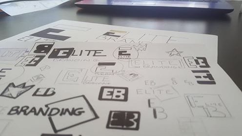
When the idea generation had completed I highlighted my favourite ideas. I then moved to a new sheet to explore them further.
Concept Logo Designs
I like to present new logo design ideas to clients in a very clear and legible way. This allows them to make pragmatic and unbiased decisions on which logo they like best. Each idea was drawn out as an icon and as a horizontal logo in black and white for the client. With no colour or effects to distract the eye the client was picking an icon based solely on the shape and orientation.
After deliberating with the team at Elite Branding Ciaran decided to proceed with idea 2. Originally Ciaran wanted the logo to be pink and black but I felt it did not work with the mission statement for the business.

Colour Selection for the new logo design
When I think elite I think royalty. Gold, Purple, Red and Silver. Gold is a very rich colour and I felt it could work well in small amounts. I felt the E icon that I had designed should have two colours. The top of the E looked like a crown so gold might work best as the “crown” on the E. I knew from experience that purple goes beautifully with gold. (for more insight on how to pick a colour for your logo read my article here). Purple is also a colour that symbolises many of the things associated with Elite Brandings mission:
- Royalty
- Wisdom
- Respect
- Problem Solving
- Creativity
- Beauty
So it was settled; the new logo design was going to be purple with accents of gold / yellow. The text in the logo would be a combination of white and black to suit different applications.
When I had decided on a colour I then had to select the exact colour values for the new logo design. I referenced many resources and colour guides to choose the colour pallete for Elite Branding.
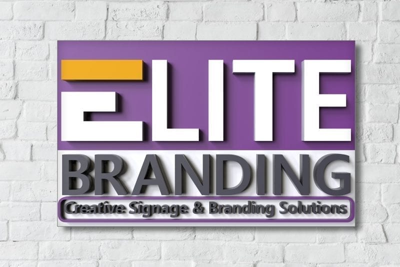
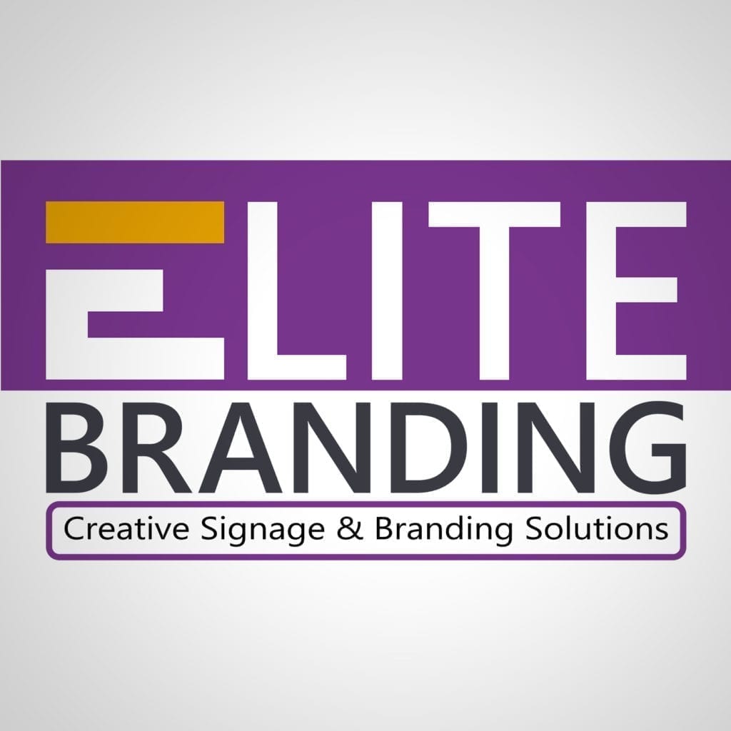
The Purple has nice rich hues and is bright so that it stands out on a White background. This is important as Elite Branding will be using the logo on white vans and at large exhibitions. The gold colour is more of a rich yellow tone that leans more towards red than green. The purple and yellow tones are perfectly complementary and bring a real colour pop to the new logo design.
Layouts for different applications
When I had decided on colours I then started laying up the design in my computer software (I use Adobe Illustrator). A square logo was designed for icons and profile pictures. The icon needed to be simple and legible at a tiny size (for tabs on their website when in a browser).
I chose to just work with the E so that the icon was really striking and legible when converted in to a small graphic size.

I also designed a van decal layout. I was aware that Ciaran wanted the new logo design used on their van.

I created a 3D design of the new logo for Elite Branding. This helped them envisage how it will look when transformed into a sign.

Facebook & Instagram Profile Logos
For every new logo design it is vital that the shape and size is correct for social media business pages.
Elite branding are on Facebook and Instagram and will need graphics for their profiles to show off their new logo design.
Social Media graphics were created and sized perfectly so that they could add them to their business profile pages and cover photos.
Brand Pack for Businesses
All of the logo images for print and for web were sent to the client in a Brand Pack. The files also include native vectors of the logo so that the Elite Branding team can work with the logo in future to scale it up / down for future applications e.g. Popup Banners for Trade Shows / Business Cards.
If you are interested in finding out more about Brand Packs please get in touch today and boost your business in 2019.
Get a Brand Pack for your Business
Thanks for sharing like this blog. Anyone is interesting to get knowledge about Brand Designing Services so they may follow this content it will be worthwhile for them.
Great Work! The logo designed by the team is top-notch and will surely attract its potential customers.
Thank you Aengus I really enjoyed designing this logo!
These are quite interesting tips about logo design. It is very true that outstanding creative designs attracts attention and creates a positive impression about a brand so its better it is done by experts in the field. I manage a film production business, and my work sometimes goes toward graphic design and visual assets, rather than just the moving image. Since we are working on our logo images with a leading Sunshine Coast graphic design, here I got valuable tips to implement in our business logos.
Congratulations to both your team and Elite Branding on the fantastic logo design! It’s clear that a lot of thought and creativity went into developing a brand identity that truly reflects their mission and values. The detailed process you outlined, from brainstorming to colour selection, showcases the meticulous approach you take with each project. The final design, with its elegant combination of purple and gold, captures the essence of royalty and quality perfectly. It’s inspiring to see how you bring a brand’s vision to life through strategic graphic design. Well done!