Today I would like to share some tips on how to pick a colour for your logo in 2019. These tips are based on a combination of my experience in logo design and trends that are happening in 2019. This article will be part of a series focussed on logo design where I will share professional design insights with you so that you can improve the way you do business in 2019. First I want to explain why you need a logo for your business.
Why you need a logo for your business
I regularly get asked “Do I need a logo for my business?” or “I have a text logo should I get an icon too?”. My answers are always Yes. You do need a logo for your business success. A good logo will:
- Help your target audience immediately identify with your brand
- Be clear and eye catching
- Represent your business mission / what you do
- Be in keeping with current trends
- Be simple in structure
- Adapt easily to different uses e.g. business cards, Facebook Profile…etc
Investing in a new logo and branding can be a game changer for businesses. I have met many businesses down through the years who have seen great success following a brand redesign.
The best way to know if your business is in need of a brand refresh is to look at businesses who are successful in your sector. I’m not talking about looking at local competitors but instead look at international businesses who target your dream audience. How does their brand “speak” to customers? What colours are they using on their media. How does their logo change across media?
Compile a list of logos and brands and try to evaluate what elements of each you like. This bit of research will help your business and it will help your designer to understand your needs.

Case 1: LB Fitness
We selected a deep pink and black colour combination for LBFitness when we designed Lyndseys branding in 2017. She had previously been using text that she designed in MS Word and found it hard to get clients to buy her fitness apparel or trust her gym when she promoted it on social media.
Her classes are specifically tailored for shaping female physiques and incorporate weights. The deep pink represents beauty and passion and the black conveys strength – all of which are elements of the LBFitness mission.
Now that you know you need a logo let’s dive into my top tips for how to pick a colour for your logo .
Today we will look at Colour
Choosing the right colour for your brand is EVERYTHING. Different colours mean different things. The psychology of colours is a very interesting subject and it has a massive influence on buying trends and building trust with your audience. First impressions are everything in business and often the first thing that people look at on Facebook pages, websites and business cards is your logo. Get the colour wrong and you could send the wrong message to visitors.
Colours evoke different emotional responses
Here is a quick overview of colours and their associated meanings (for more insights visit this article by Small Business Trends).
Red
- Urgency
- Encourages Appetite
- Passion
- Movement
- Excitement
- Warning
Blue
- Peace
- Reliability
- Water
- Tranquility
- Security
- Reduce Appetite
- Productivity
Green
- Health
- Tranquility
- Power
- Nature
- Harmony
- Relaxation
Purple
- Royalty
- Wisdom
- Respect
- Problem Solving
- Creativity
- Beauty
Yellow
- Cheerful
- Optimism
- Caution
- Anxiety
Black
- Authority
- Power
- Stability
- Strength
- Intelligence
- Overwhelming
Grey
- Practicality
- Old age
- Solidarity
- Nothingness
- Depression
White
- Purity
- Cleanliness
- Safety
- Neutrality
- Creativity
- Unaltered
As you can see each colour conveys a different set of emotional responses. So deciding how to pick a colour for your logo is more about understanding your audience than picking a favourite tone. What does your brand represent? What do you want people to do when they see your brand? How do you want your audience to feel when they are on your Facebook Page or Website? These are all questions that will help you choose the perfect colour combinations for your logo and brand.
Colour affects culture
Different cultures perceive colours in different ways. When you are deciding how to pick a colour for your logo you should also consider researching cultural differences. Always check if your colour selection is appropriate for where you will be selling your products / services.
Red is a colour that western cultures perceive as warning and danger while in China red represents royalty and wealth.
White is a colour that western cultures perceive as pure and modern while in China white represents death and mourning. Black is the colour for death and mourning in western cultures.
You can use cultural colours to your advantage and give your business a competitive edge over international businesses. For example Green is a colour that is associated with Ireland. Many Irish businesses, especially food producers, will use green in their branding to stand out from imported goods.
Taking in to account how different cultures perceive colours will add resilience to your brand. It also helps you to future proof your business when you grow and expand your operations overseas.

Case 2: Boost HR
We chose a green colour for the Boost HR logo to highlight that it is an Irish business. Green is the colour for Ireland and Karen’s clientele are Irish businesses seeking remote HR Solutions.
This particular green has yellow tones. This conveys cheerful feelings which are in line with the graphic design for her new brand. The exact values were selected after researching many design trends for web and print colours so that the brand appeared modern and stylish to Boost HR’s ideal customers.
What colour to pick?
You need to pick a colour that is in line with your values and mission statement. Your colour should also be chosen to suit the needs of your target audience because your biggest fans will want to share your brand with likeminded people. If you get the colours right encouraging people to showcase your brand will be a breeze.
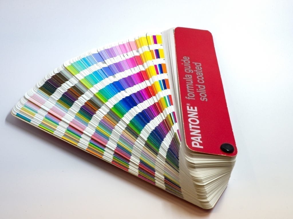
You can start by looking at the primary colours and deciding on your main colour based on the feelings that you want your brand to convey. In printing there are 4 colours – Cyan (blue), Magenta (Pink), Yellow and Black. In digital media there are 3 colours Red, Green and Blue. All of the other colours are created through combining the main colours for either print or web. Pick your main colour first and then focus on tones.

Not all shades are created equal
When I am selecting colours for a brand identity I spend hours trying to choose the correct values for the logo. I consult with many online trend resources, my design library in the studio and my gut instinct as a professional designer. Different hues of colours represent different consumer perceptions e.g. a bright orange can symbolise danger where a deeper hue can convey innovation.

When deciding how to pick a colour for your logo you should also spend some time researching colours that are modern and colours that are dated. Choosing colours that have dated or that clash is a surefire way to lose customers. There are scenarios where choosing old-fashioned / contrasting colours works but this an art that should be left to your designer and a trained eye.
Start with black and white
Always make sure that your logo works in black and white. This will make sure that your logo is legible when people print documents in black and white and it is also great for apparel.
When I am designing new brands and logos I always start with a pen and paper and this helps me make quick decisions on what works for the business.

Share your logo for Professional review
Understanding colours is vital to your business branding so make sure you consult with a professional resource for selecting your colours. We have spent many years developing our “eye” for design and use this when creating new brand and logos for other businesses. Have you got a logo that you would like critiqued for free? Share your logo with us here and we will let you know what we believe your logo conveys and who we think your audience is. This will put your logo to the test and help you evaluate whether you need a redesign.
I hope that this article showed you how to pick a colour for your logo. Next week I will share more logo tips for you and your business. If you would like more information on our branding service please click here. Here’s to a colourful future for your brand.


It is such good content. This blog is very informative for those people they want to take knowledge regarding Product Design Services they should read this content once time.
Thank you I try to keep it relevant to real needs 🙂
Nice blog here! Additionally your web site a lot up fast! What host are you the use of? Can I am getting your affiliate hyperlink in your host? I desire my web site loaded up as quickly as yours lol
Hi thank you I host with blacknight.com 🙂
You can definitely see your expertise within the article you write.
The arena hopes for even more passionate writers
such as you who are not afraid to mention how they believe.
All the time go after your heart.
I totally agree – there are so many creative people out there who can help businesses succeed. I love sharing my insights in to design with people so thay can apply them to their new business ideas.
Really color combination is not easy thing. I was also confused with selection of the color for my logo and website.. but your tips will really help me.
Hey There. I found your blog using msn. This is a really well written article.
I will make sure to bookmark it and return to read more of your useful info.
Thanks for the post. I’ll certainly comeback.
I hope that it continues to help you with your business – Ilook forward to seeing your return to read more articles in 2020.