Business Success Story for Rent a Recruiter
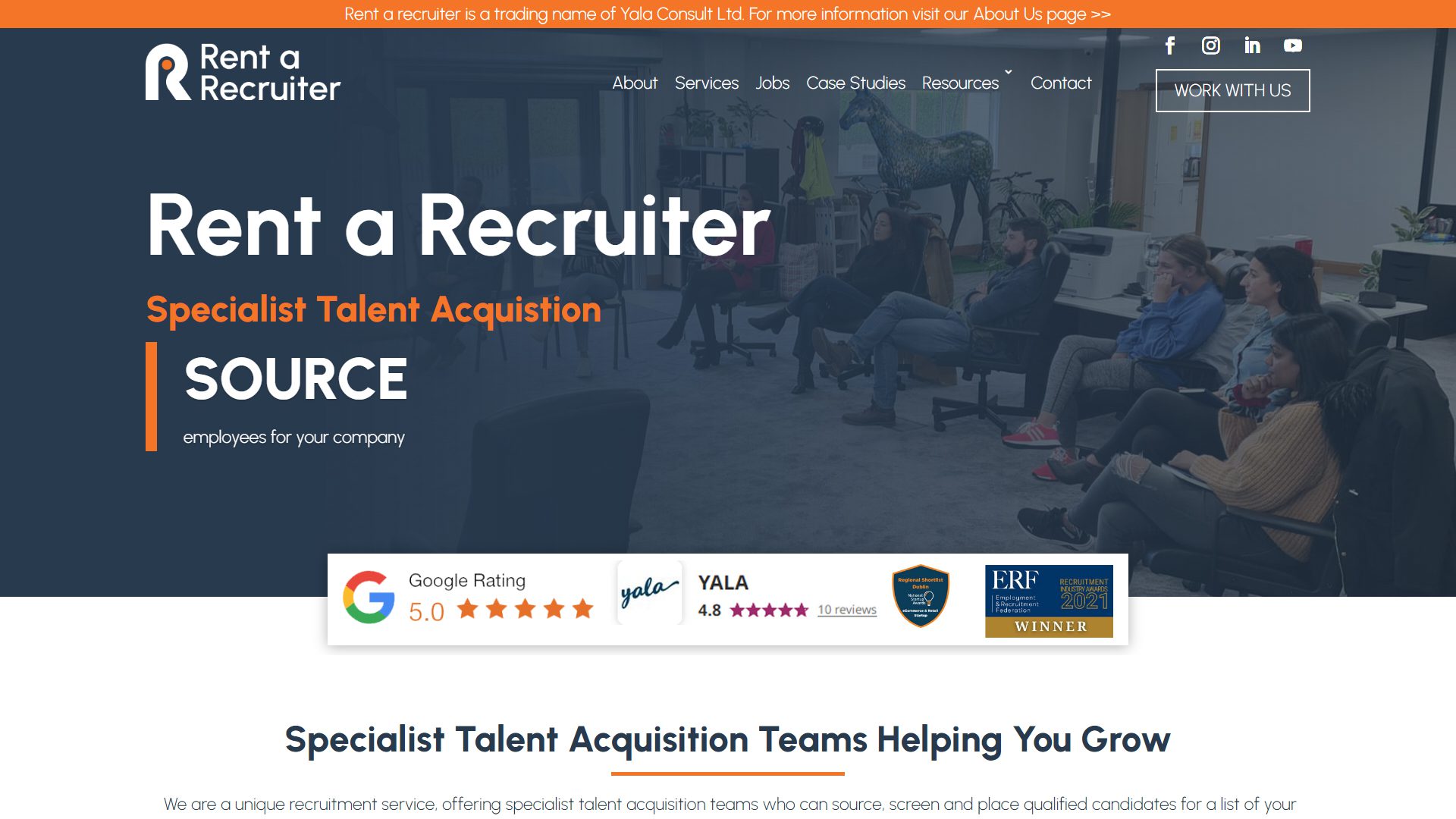
Rent a Recruiter approached us in May 2022 to design a new website for their business. They already had a website for their business trading as Yala. They planned a complete rebrand of their business and hoped to launch a new online space for their ideal cusotmers in July 2022. It was an extremely tight deadline for such a big website but with all hands on deck and brilliant collaboration with their team we managed to get them launched this week.
Their old website was pretty modern but….
When we first looked at their old website we thought it looked quite modern and clean. Upon meeting with Barry and Julieanne from the Rent a Recruiter team we learned why they needed a new website. Barry and the other directors had created hundreds of incredible resources for businesses and people looking for jobs. We had not noticed this at all in their website as it was hidden from the main navigation of the website.
Our first challenge was to address the user experience and browsing of this website. To address these issues, we performed a full sitemap evaluation of their old website. We designed a new layout for their website to make it quick and easy for people to find their content.
Lots of hidden information that was hard to find
Rent a Recruiter provides advice for people searching jobs and businesses offering jobs. They work with businesses and display their profile in the recruitment directory. They have a directory of jobs available to people who wish to apply for work. In their resources, they provide job tips, how to get jobs and how to write CVs. They do this in formats including; videos, podcasts, press releases and publications.
We wanted the new website to make all of this wonderful information more prominent, accessible and optimise it to be easily updated.
All the hard work but none of the rewards
Barry explained that the old website was underperforming in Google. Their team were doing everything right, like posting regularly, creating videos, attending and speaking at events…etc but these efforts were not proportionate to the visits and interactions on their website.
They also found updating content on their old website quite difficult. They were given little direction on how to change things and the website was completely insecure and unoptimised.
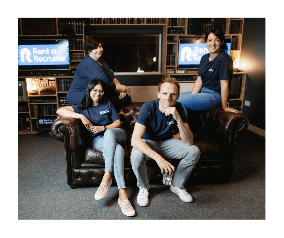
Some of the Rent a Recruiter team
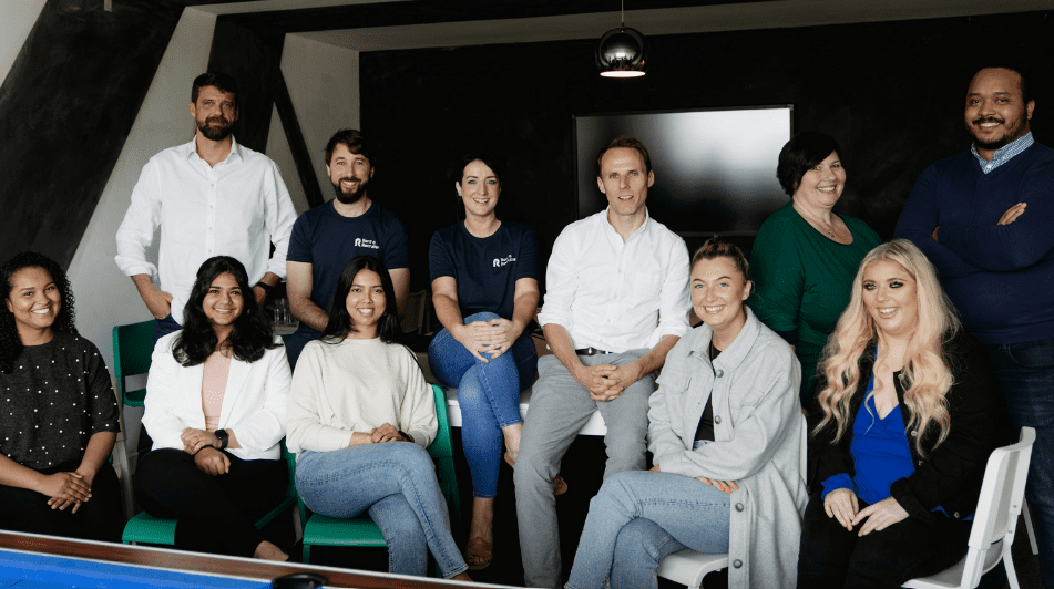
Rent a recruiter have global offices in Ireland, US, Australia and UAE.
How we helped Rent a Recruiter
The business had traded as Yala and they wanted to update the business to trade as Rent a Recruiter. This required a full brand refresh and website design.
Site mapping & User Experience
The first thing we did was trawl through all of the resources that the business had created and all of the content in their existing website. We imagined what their ideal customer would like to do and completely redesigned their website navigation to suit their ideal customers needs.
Getting to grips with their client needs
We worked with the Rent a Recruiter team to understand what they offer and who they can help. They wanted to appeal to businesses in Ireland, the US, Australia and Middle East as they have offices in each location. They wanted to make it easy for businesses to understand how they can help them with recruitment. We presented their services in clear layouts on the website and included powerful CTAs (calls to action) throughout the website.

Site mapping and user experience
Tight deadlines required clear communication
We worked with the Rent a Recruiter team weekly over video and daily by email to ensure deadlines were met. Website design can take some time so we do things different to ensure that our clients get insights into the designs fast via graphic mockups. We presented these website and branding mockups via pdfs.
Mobile first design
We designed this website to be mobile first and to look fantastic on every device. The PDF mockups of the website design allowed them review the design before we built it out. This helped the client to see how the website design would look for each page and how sample posts would be designed.
Client access and training
We designed this website so that our clients can easily update the content. We put additional measures in place to ensure that creating new content would be easy and look great. The client received logins so that they could rewrite old content and create new content.
We helped them to understand how to write content for Search Engine Optimisation (SEO). SEO optimisation is what helps a client’s website to rank high in Google and appear in the top pages for their relevant search terms. We performed extensive SEO analysis to allow them to rank for new keyphrases. Their old website was not optimised and lacked the right phrases for their ideal clients. We implemented all these SEO strategies in the content of the website with Julieanne. She helped us to decide which terms their clients search for online.
Branding
We redesigned their branding and logos, reinventing their colour scheme and online identities. We came up with several revisions for the branding and worked with their team to make sure that it was correct. We designed the logo with light and dark backgrounds so that it works across all mediums.
About Rent a Recruiter Specialist Talent Acquisition:
Rent a Recruiter is an Award-Winning Talent Acquisition Team. The work with businesses worldwide offering unique recruitment services. They source, screen and embed the best talent out there so you can focus on your business goals.
Their top staff have worked with some of the best agencies in the industry. Their experience allows them to offer their clients a tailored & fresh approach. At Rent a Recruiter, everyone’s opinion matters. Continuous development and open communication is at the core of their business success.
Providing the highest standards of service, advice and support has driven their success. Every client has different needs, they tailor their services to suit specific goals. Their exceptional Talent Acquisition Partners specialise in sourcing, screening and placement.
WATCH VIDEO: Rent a Recruiter Website Design
Unique features in this Website
- We added their recruitment software into the new site that shows latest jobs.
- We have connected their social profiles so that social posts feed into their site.
- We have Google optimised their website.
- We incorporated thorough SEO to optimise all the content and rank in Google.
- We performed a full re-brand of this business to appeal to their target market.
- We have made their content very browsable and approachable.
- We have refreshed how the business appears online to encourage interaction.
- We displayed call to actions throughout the website.
- We created contact forms that reroute to different departments when you hit send.
- We have put in custom forms for people to be able to get a quote or upload their CVs to the staff at Rent a Recruiter.
If you would like a website like Rent a Recruiter’s please let us know and we will help you.
See this website in action:
Website URL: https://www.rentarecruiter.com/
