Today I want to chat about landing page marketing. I do not use fear tactics. This article will focus on landing page design and marketing tips. First let’s explore marketing.
Marketing: What is FUD?
A lot has changed with how we interact with businesses. Years ago we were inundated with information by sales staff. Back then, sales people used a tool like FUD (fear, uncertainty, doubt) to sell.
Why I believe FUD does not work; with examples*
*My examples are scenarios from my imagination. They are designed to help you grasp this concept in a lighthearted way.
The concept behind FUD is to plant a seed of fear into peoples minds:
Example: A fitness studio that sells classes. They try to convince you that working out at home puts your life in danger.
Your landing page is meant to build trust not anxiety. So try to use the landing page design to reduce anxiety. Is your landing page design causing your reader anxiety? Do you use fear marketing? Fear marketing does not work for landing page design. Nobody likes fake news or false marketing.
Fear tactics create false feelings
Years ago, before the internet, it was difficult to tell if fear tactic claims like this were real or not. So people thought; maybe my treadmill will actually kill me.

Credit: Via Twitter @UnkemptShow.
Fear tactics undermine others
Now that the seed of fear, uncertainty and doubt is planted the sales person acts. They swoop in and saves the day. Using fear tactics the business would let people know how their solution works. They will also undermine the efforts of every other business while talking about their offering.
Example: Our 100% safe gym is here, so put that treadmill in the bin before it kills your family. Don’t go to another gym because they don’t know this secret about killer treadmills.

The old way to market – in a nutshell
- Step one, create the fear.
- Step two, state your fix.
- Step 3, undermine other businesses.
This is bad for your landing page.
Try to not mention other businesses in your landing page. That just leads to them googling other businesses.
Try not to create anxiety. This makes them unsure of decision making.
Try not over sell your claims. This makes your reader uncertain it is honest.
Using FUD is the complete opposite of how I believe a landing page should work.
Fear tactics are a disinformation strategy
The aim with fear tactics is to invent a fear. Then sell to people who think that their life will be in danger if they don’t buy. Hence FUD is also referenced as Fear, Uncertainty, Dishonesty. The aim of a landing page is to build trust with your audience. To entice them to volunteer their information to you. Being dishonest will certainly affect trust and damage the effectiveness of your landing page.
Fear tactics were widely used in the 70s, 80s, 90s. They are still used today by some companies and for propaganda. Claims are often misleading and people feel tricked after purchase. This makes people more likely to judge your offering. If they feel tricked then your landing page marketing was not effective. You have failed to sell effectively. Sounds a bit off putting right?! So stop using these outdated techniques when you are trying to sell to people via your landing page.

Why I believe fear tactics don’t work on landing pages
In my opinion this marketing tactic just does not work any more especially on landing pages. I think that the internet has dulled its power and people are generally more sceptical of businesses these days. It might be tempting to use fear tactics in your landing page but please don’t! It is much more powerful to use a strategy that is the complete opposite of FUD in your marketing which I will discuss now.
What is a landing page?
A landing page is somewhere that you send your followers to try get them to take action on engaging with your business. You should not use fear tactics in your landing page because it will increase the bounce rate of your site. You can use landing pages to:
- Get people to subscribe to receive emails from you
- Get signatures for a petition
- Get more questions via a form
- Sign up people to an event
This is a single page website (or a section of a website with no menu) that is deliberately written to entice visitors to give you their email address or perform another action. Landing pages are carefully curated so that they define a clear problem, show a solution and entice an action.
This action allows you to build trust with new visitors e.g. “try before you buy” or “get exclusive offer by subscribing”. Always remember – people are not stupid, so trust building is vital to the success of your business today.
Take the cringe out of marketing
Selling is tough and often makes us entrepreneurs cringe. One way to make sales easier is to help others understand the benefits of your offerings. Don’t use fear tactics in your landing page like they did years ago because it make the person feel stupid.
Instead you should highlight the decisions they have made to date and how your offering compliments that decision. Fear marketing should not be used and instead you should empower your audience in your landing page.
I highlight both strategies in the example below; again using the fitness classes as an example.
Fear Marketing Example:
Did you know that every time you step on a treadmill at home you are putting your life in danger?! Our 100% safe gym is here. So put that treadmill in the bin before it kills your family. And don’t go to another gym because they don’t know this secret about the killer treadmills.
Come work out on the floor with us. Where you will never fall and break your neck.
Empowerment Marketing Example:
Are you feeling a bored of working out alone? Do you wish you used your treadmill more often, instead of letting it collect dust? Our uplifting fitness classes will get you out of your fitness rut.
You will be surrounded by people who share your fitness visions. Come along to our floor workouts every saturday. Where our experts will show you a fun way to get fit and inspire you to dust off that treadmill midweek.
Empowerment for landing page marketing
Can you see what I am talking about now? In my opinion the first example is just pure cringe! I still see this tactic being used in landing pages and other marketing and it just doesn’t appeal to me.
The second example does not use fear tactics. It is empowering and evokes a sense of urgency without causing anxiety. This is a great way to close sales with your landing page. Your business will get better reviews. You will get more traffic to your website. You will convert people to your brand.
I hope that you now see the best way to market your landing page.
Have you landing page Questions?
I want this blog to help you succeed in your online business. Have you seen fear tactics used in landing pages before? Do you want to know more about landing pages? Or maybe you are finding it hard to script your empowering message.
I have lots to share but I don’t want to bore you either. I love helping businesses explore landing pages and marketing tactics. I can help you script the perfect landing page. I can give you free feedback on your landing page.
Ask me your questions and I will follow up with specific details to help you. I am thinking of writing a post on how to structure the perfect landing page – is this something that you would like to read?
This post is a broad introduction to the topic of marketing tips for landing pages. Would you like more detailed insight in to landing page design? Let me know in the comments below or on any of my social media channels.
Want a landing page for your business?
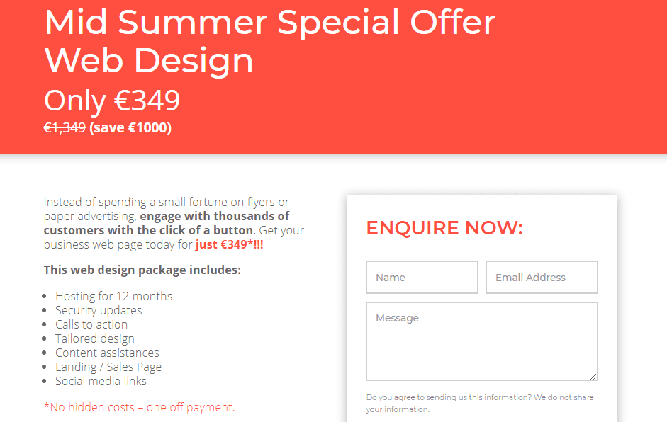
If you are hoping to convert all of your Facebook and Instagram fans into customers then a landing page is a step in the right direction. It allows your audience click through to a limited offer or a specific call to action in a non-salesy way. We do not use fear tactics to design your landing page and instead empower your audience to take action with your business.
Get our special offer *VALID AUGUST 2019
We actually have a landing page ourselves that shows off our latest offer which you can see here: Get a landing page for your business and convert followers into customers.
I love designing these pages and will work with you to capture the attention of your ideal customers and get them to take action today.
Thank you for reading: I hope this helps you craft a landing page that avoids fear tactics
Marianna Kane
MD DesignBurst Ltd


Landing pages are so intimidating… getting the sales copyright and knowing what angle to sell just stops me in my tracks. This is something interesting to think through though.
I used to find them intimidating too until I started writing them to actual people. So what I do now is I think of a person that I know and write it as if I am chatting to them. First I relate to their current situation, then I let them know how I could help and I also cover some things that I think will stop them from taking action. Just be honest and be yourself – its the best approach I think :-). Please let me know when you make your first one – I would love to see it!- Marianna
I agree, lets take the cringe out of marketing! I want people to come back because they want to be there, not because I’ve scared them into think they have to.
Yes Jordan its so much nicer to to empower than to shame or frighten!
Thanks for your tips – I’ll keep it all in mind.
Brilliant – I wish you every success 🙂
Wow – I’d never really thought about this before. Fear as an influencer is never a good thing, as you see it.
Yes it is a weird one because now you have read this; I think you will see it being used a lot! A lot of businesses still use fear tactics – I suppose its just not my style.
Huh. I hadn’t thought of it like this before. I LOVE the concept of empowerment marketing versus fear marketing!
Yes and it’s such an easy change for businesses too because it makes sales a lot more enjoyable and customer service is easier when you don’t use fear tactics because it doesn’t spark that fight or flight response in customers!
Excellent points Marianna, I can’t stand that fear cringe angle to selling. Lots to think on there thank you
Yes Trisha its much easier when its non- cringe!